GLIDE's Navigation System
A wayfinding system that resulted in giving structure, identity, and aligned language to the whole organization.
Client: GLIDE Foundation
Year: 2018
Team: Susana Eslava
My Role: Design Researcher, Visual Designer, Producer
Background
GLIDE is a pioneering human services and social justice non-profit organization serving the most vulnerable and marginalized individuals and families in San Francisco, CA.
Over the decades, the programs and services GLIDE provides emerge and disappear in direct response to the needs of the community. This means that the organization, which operates inside a building initially conceived for housing purposes, is in a constant state of change, operationally and physically. Departments and programs have been placed randomly around the building, wherever space was available at a given moment.
These conditions plus a lack of signage resulted in all stakeholders not really knowing the organization and getting lost in the building.
GLIDE wanted to improve the navigation in the building through signage.
How can we provide all of GLIDE’s constituents with the information they require to successfully navigate the organization in a way that is accessible to all, and that is also easy for the organization to maintain?
Tools & Methods
Process
I had "insider knowledge" of the workings of the organization as I was a staff member for a few years before completing this project as a contractor. In my years as an employee and part of the Communications department, I got to engage with all of GLIDE's constituents. But as happens with everyday tasks and familiar places, at some point, I navigated GLIDE (physically and organizationally) by muscle memory, I stopped seeing the organization objectively.
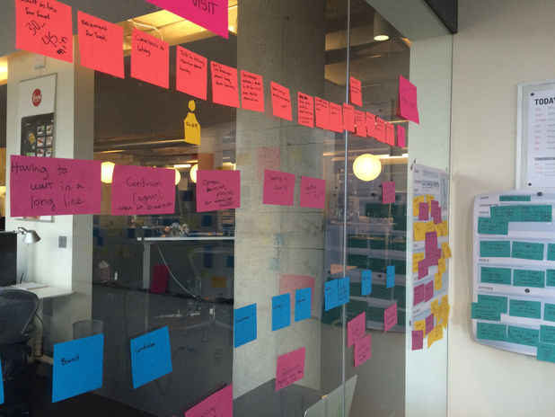
So, the first step I took for this project was seeing the organization again, (re)searching, and doing an assessment to clearly define the project needs. I stood out from my "staff" point of view and mapped out the organization as a whole as well the experience of other stakeholders. In doing this, among many things, I found that the organization had the regulatory and safety signage in place, but (desperately) needed identification, information, wayfinding signage, and a coherent and unified language.
*some of the research and prototyping took place during the 2016 Barn Raise event in San Francisco.
Insights and Challenges
-
Ever-changing spacial and organizational configuration.
-
Multiple user types with very different needs: staff, donors, congregants, volunteers, service providers, and program participants.
-
Users with low literacy levels, speakers of other multiple languages other than English, many who live with permanent and temporary disabilities, and many who access the building in altered states of consciousness.
-
Dissonance between the institutional structure and internal lingo versus the way external users understand and navigate the organization and its services.
Proposed Interventions
-
To choose program participants as the main users of the system and center their navigation (spacial and other) needs.
-
To make the information architecture and use of language align and come as close as possible to what program participants and volunteers use.
-
To go through the signage process in phases, first information signage (low-hanging fruit) and then wayfinding
-
To develop icons for all the programs and departments that provide direct services.
-
To color code the wayfinding system and rank the information by floor first and then alphabetically.
-
To produce the wayfinding system using adhesive vinyl, which is easy to install, easy to update, hard to tamper with, and safe(r) in case of an emergency like a fire or earthquake.
Outputs & Outcomes
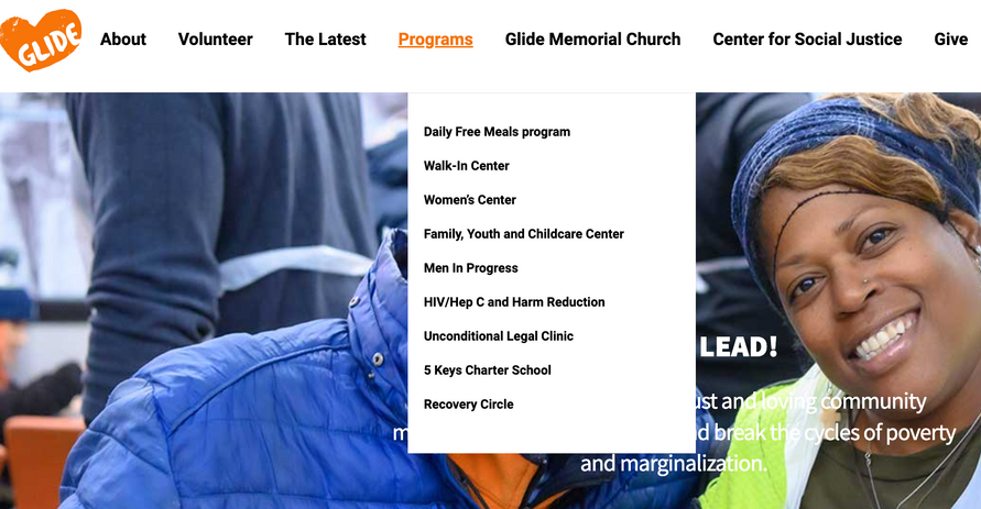
In addition to solving the navigation problem, through the development and execution of this project GLIDE was able to show the wide breadth of services it provides to all constituents (more often than not, most stakeholders know about only one or two services.) Also, the icons I designed for the programs have been used in print materials and uniforms. Furthermore, giving clarity to the nomenclature and hierarchy assisted in giving structure to the redesign of the organization’s website. Lastly, the system also serves to strengthen GLIDE’s values and brand.


